Aurora UI Kit
30 Premium Components with AI Generation Built In
Production-ready Next.js components with glassmorphism, animations, and a Claude Code skill that generates new components in the same design language on demand.
Operational scope
Stop building UI from scratch. Get 30 polished components plus an AI system that creates new ones matching your design system.
Key outcomes
- Drop 30 production-ready components into any Next.js project: PremiumCard, AuroraGradient, ShimmerButton, and more
- Use the included Claude Code skill to generate new components that match the Aurora design language
- Ship polished UIs in hours instead of weeks with pre-built dark/light mode, responsive layouts, and micro-interactions
- Customize everything with documented design tokens: colors, spacing, animations, glass levels
Included modules
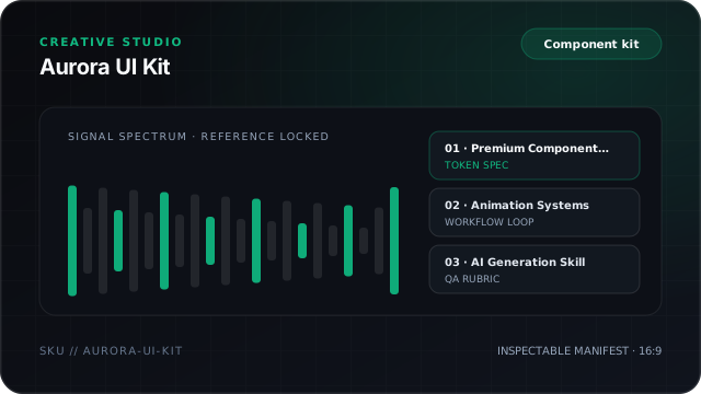
- 01
Premium Component Library
30+ components: PremiumCard (5 gradient presets, 4 glass levels, tilt, glow), AuroraGradient (6 variants), ShimmerButton, MagneticHover, FloatingElement, CursorSpotlight, and more.
- 02
Animation Systems
MorphingBackground, SplitTextReveal, Marquee, ParallaxContainer, StaggerContainer · all with prefers-reduced-motion support.
- 03
AI Generation Skill
Claude Code skill that understands the Aurora design language. Tell it 'create a pricing card with aurora style' and it generates matching code.
- 04
Design Token System
Configurable color palettes, spacing scales, glass levels, and animation timings. Change one token, update the entire kit.
Coming soon
Join the waitlist
Inspect the file tree below now, and join the waitlist to get a note when delivery opens.
Join the waitlistInspect 5 package files ↓Planned scope preview
Planned module outline (illustrative preview)
This item is on the launch list and does not have a downloadable file archive yet. Entries below summarize the planned module scope under review.
Illustrative scope summary for Aurora UI Kit. Downloadable package files are not published yet; join the launch list for release updates.
1Planned product: Aurora UI Kit2Release state: Waitlist preview (not yet packaged for download or checkout)3Waitlist route: /waitlist?intent=aurora-ui-kit45Stop building UI from scratch. Get 30 polished components plus an AI system that creates new ones matching your design system.67Target outcomes under review:8- Drop 30 production-ready components into any Next.js project: PremiumCard, AuroraGradient, ShimmerButton, and more9- Use the included Claude Code skill to generate new components that match the Aurora design language10- Ship polished UIs in hours instead of weeks with pre-built dark/light mode, responsive layouts, and micro-interactions11- Customize everything with documented design tokens: colors, spacing, animations, glass levels- You want repeatable studio workflows, prompt structures, and quality checklists for creative output.
- You want to review the planned module scope and join the launch list for release notice.
- You want one-click unreviewed content generation with zero human taste direction.
- You need an immediately downloadable pack today rather than a planned release.
Questions and scope notes
What tech stack does this require?
Next.js 14+, React 18+, Tailwind CSS 3+, and TypeScript. Components use zero external animation libraries, pure CSS + React.
What makes this different from shadcn/ui?
Aurora UI Kit is a design-forward layer that sits on top of shadcn. While shadcn gives you unstyled primitives, Aurora gives you the visual polish, glassmorphism, gradients, micro-interactions, and the AI skill to generate more.
How does the AI generation skill work?
It's a Claude Code skill file (.claude/skills/) that you drop into your project. When activated, you can describe components in natural language and it generates code matching Aurora's design patterns.
Can I use this in commercial projects?
Yes. MIT license. Use in unlimited personal and commercial projects.